My first project conforms to the rule of thirds. I placed the key words; Emphasis, Balance, and Contrast onto intersection points of the rule of thirds grid. I placed the word Emphasis on the top line and made it a large font in order to draw your eye to that area first. I then placed the word Balance in the bottom right intersection point and made the font smaller than the word emphasis. I also tilted the word Balance 45 degrees. I placed the word Contrast on the bottom left intersection point and made the font smaller than the word Balance. I did this so your eye goes to the words in the following order; Emphasis, Balance, and Contrast. In order to bring the words together as one image I used the word Repetition to form a circle encompassing the three words Emphasis, Balance, and Contrast. I used the word Flow to go from the bottom left to the top right of the page to clear negative space and to get the viewer’s eye to see the entire page. I placed the word Alignment in both the bottom left and top right section of the page to balance out my design.
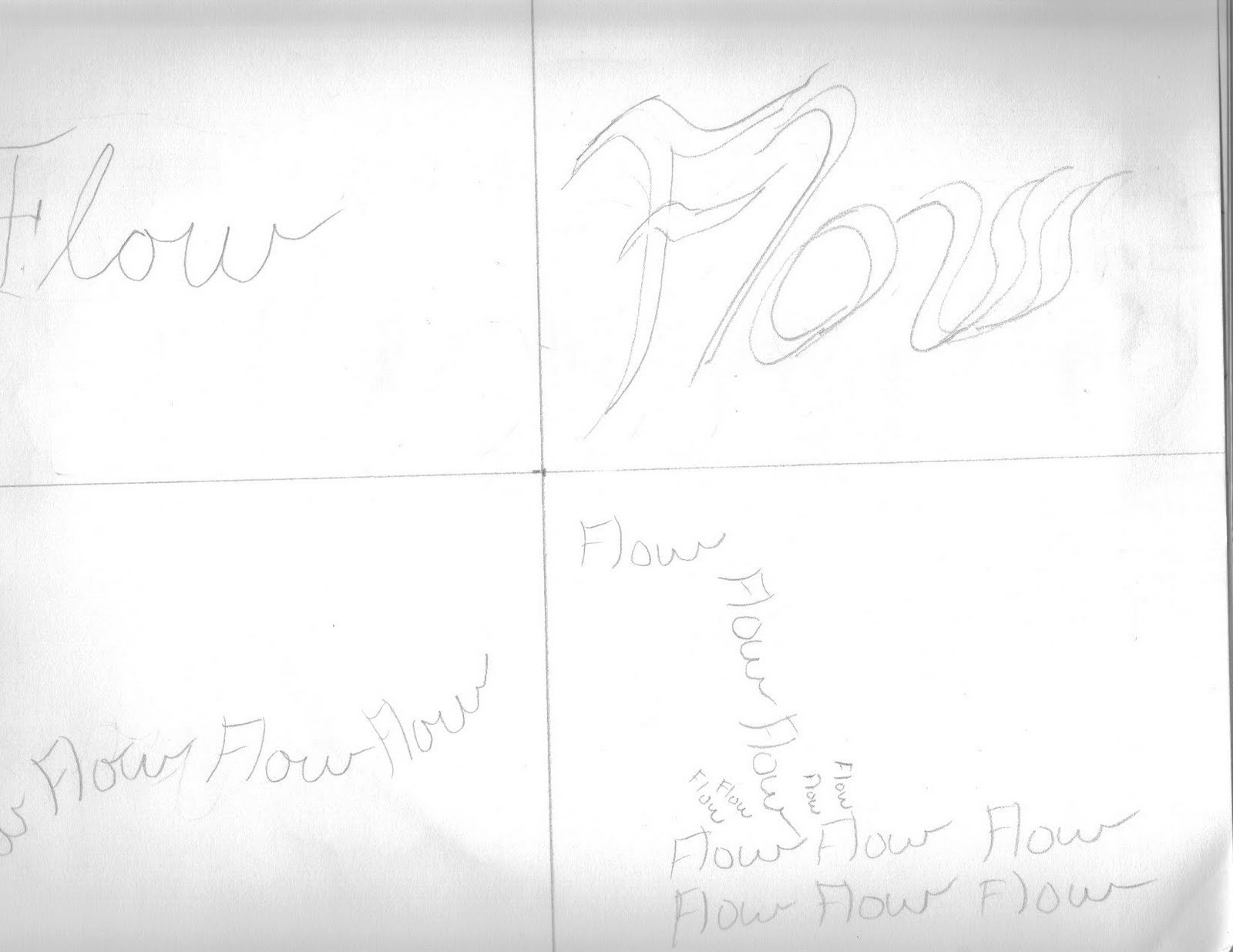
I was able to visually communicate the meaning of each word through the use of typographical forms. I made the word Emphasis very large and designed it using perspective drawing techniques. In order to communicate the word Balance I used the shading of the individual letters. I made the first two, middle, and last two letters a darker shade. I also offset the second letter “A” downward in the word Balance so that it makes the word look like it is a balance (equipment ---_---). For the word Contrast I also used shading to convey the meaning. I put the letters “Cont” in dark shading and then placed the letters “RAST” in front of them but with white shading. For the word Repetition, I repeated the word in a circular image. I also tried to pick a font that was plain and not eye attracting so that it would settle in the background. For the word Flow I had the word repeat following a flowing line. I also chose a font style that was fluid. For the word Alignment I formed straight lines with the repeating word. One Alignment line aligned with the letter “E” in Emphasis. The other Alignment line aligned with the “E” in Balance.